

Start here
Why Most People Feel Lost with Color
Core skills
The Three Rules That Do Most of the Work
Apply it
Building Your Personal Color Foundation
Troubleshoot
Common Mistakes and How to Avoid Them
Level up
Putting It Into Practice
Why Most People Feel Lost with Color
The most common reason people claim to be bad at color isn't a lack of taste — it's a lack of a starting framework. Without one, getting dressed involves a series of small, uncertain guesses: Does this go? Is this too much? Why does this feel off?
Formal color theory — the kind taught in design school — is genuinely useful but mostly unnecessary for building wearable outfits. What everyday dressing actually requires is a simpler set of repeatable decisions. Once you have those, the guesswork collapses into a short checklist you run automatically.
Neutral
A color with low saturation — such as black, white, grey, navy, camel, or olive — that pairs readily with most other colors without competing.
Tone
How light or dark a color is. Matching tone across an outfit creates visual cohesion even when the hues themselves differ.
Undertone
The subtle warm (yellow, orange) or cool (blue, pink) quality within a color. Mixing undertones inconsistently can make otherwise compatible colors look mismatched.
Saturation
How vivid or intense a color is. Highly saturated colors are bold; low-saturation versions of the same hue are muted or washed out.
Accent color
A single, more visually prominent color used to draw attention within an outfit, while neutral pieces play a supporting role.
Monochromatic
An outfit built around one color in different tones, shades, or textures — for example, light grey, charcoal, and white together.
The goal here isn't to turn you into a colorist. It's to give you enough structure that color stops feeling like a liability and starts feeling like a tool.
The Three Rules That Do Most of the Work
Experienced dressers rely on a handful of reliable principles rather than intuitive leaps. These three handle the vast majority of everyday combinations:
1. Anchor in Neutrals
Neutrals — black, white, grey, navy, camel, and olive — pair with almost everything. If two or more pieces in your outfit are neutral, you have room to experiment with a third. If all three pieces are bold colors, the margin for error shrinks sharply.
2. Match Tone, Not Just Hue
Tone refers to the lightness or darkness of a color. Outfits where tones are unevenly distributed — one very dark piece beside two very light ones — can look disjointed even when the colors themselves aren't clashing. A light blue shirt, stone chinos, and white sneakers read as cohesive because they share a similarly light tone.
3. Limit Accent Colors to One
Pick a single piece to carry your color — a rust jacket, a cobalt scarf, a burgundy bag — and keep everything else supporting. This approach looks deliberate rather than busy, and it makes it far easier to repeat and remix the outfit later. For more on building these kinds of repeatable combinations, see outfit formulas that take the guesswork out of daily dressing.
Start With One Bold Piece
If you're unsure where to begin, choose one item in a color you genuinely like and build the rest of the outfit in neutrals around it. This method is nearly fail-safe and trains your eye for what the accent color can handle. Once that combination feels natural, you can start experimenting with secondary colors.
Building Your Personal Color Foundation
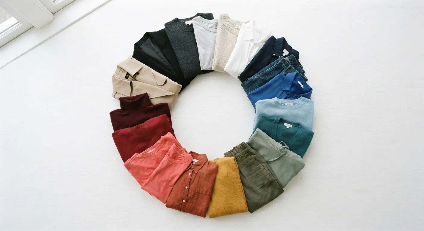
Rather than starting from scratch, audit what you already own. Lay out your clothes and group them by color family. Most wardrobes cluster naturally into two or three dominant families — often without the owner realizing it. That cluster is your personal palette.
From there, identify which neutrals you already have in multiples (a sign they're working for you) and which colors appear only once. Single-use colors are often the ones causing friction — they don't connect to anything else. Either build around them intentionally or phase them out.
If you're refreshing pieces seasonally, transitioning your wardrobe between seasons without starting over is easier when your existing palette is already cohesive. New purchases integrate more naturally when they share tones with what you already own.
Your Wardrobe Already Has Answers
Most people have more color coherence in their existing wardrobe than they realize — they just haven't mapped it yet. Before buying anything new, spend fifteen minutes grouping what you own by color family. The patterns you find will tell you which gaps are real and which purchases were just unconnected impulses.
Common Mistakes and How to Avoid Them
Even with good instincts, a few recurring errors trip people up:
- Equal-weight clashing: Two saturated colors sharing equal real estate — say, a red top and green trousers — compete rather than complement. Add a neutral layer or swap one for a muted version of the same hue.
- Ignoring undertones: Colors have warm (yellow- or orange-leaning) or cool (blue- or pink-leaning) undertones. A warm olive and a cool grey can technically both be neutrals, yet look mismatched together. When building a base, keep undertones consistent.
- Over-matching: Wearing the exact same color head to toe — without variation in texture or tone — can look flat. Monochromatic outfits work best when you vary the depth or finish of each piece.
If you're also introducing pattern into your combinations, wearing patterns without looking mismatched follows similar principles: dominant versus supporting, and tonal consistency over exact matching.
Putting It Into Practice
A useful exercise: pick three items from your closet and try to build an outfit using only those pieces, applying the rules above. Ask whether each piece is a neutral anchor, a tone match, or a single accent. If all three roles are filled, the outfit likely works. If two pieces are competing for the accent role, one needs to step back.
Color confidence builds through repetition rather than revelation. The combinations that feel obvious after a year of practice are exactly the same combinations that felt uncertain at the start. The framework just makes the learning faster.
For broader style foundations, the Beauty Basics hub covers parallel skills in skincare and makeup — areas where the same principle of learning a few core rules before experimenting applies just as well.
Don't Let Rules Override Comfort
These guidelines are tools, not laws. If a combination breaks a rule but you feel genuinely good wearing it, that's useful information about your personal style. Rules help you avoid unintentional errors — they're not a reason to avoid colors you love or to dress for other people's approval.
Frequently Asked Questions
Not really. Knowing a few practical rules — like anchoring outfits in neutrals and using one accent color — gets you most of the way there. Formal color theory helps but is far from required for everyday dressing.
Yes, but with care. Mixing warm and cool tones works best when one dominates and the other accents. Avoid splitting an outfit 50/50 between warm and cool — it tends to look unintentional rather than eclectic.
Build around neutrals — navy, white, grey, camel, or black — and add one colored piece. This single-accent approach is forgiving and almost always looks polished, even for beginners.
Clashing usually happens when two saturated, competing colors are given equal visual weight with no neutral to separate them. If an outfit feels loud, try swapping one item for a neutral or a muted version of the same hue.
Skin tone can influence how colors read near your face, but it's a guide, not a rule. Experiment near natural light rather than relying on prescriptive charts — personal preference and comfort matter more than any formula.
The content on this site is for informational purposes only and is not a substitute for professional advice. Always consult a qualified professional for guidance specific to your situation.